Overview
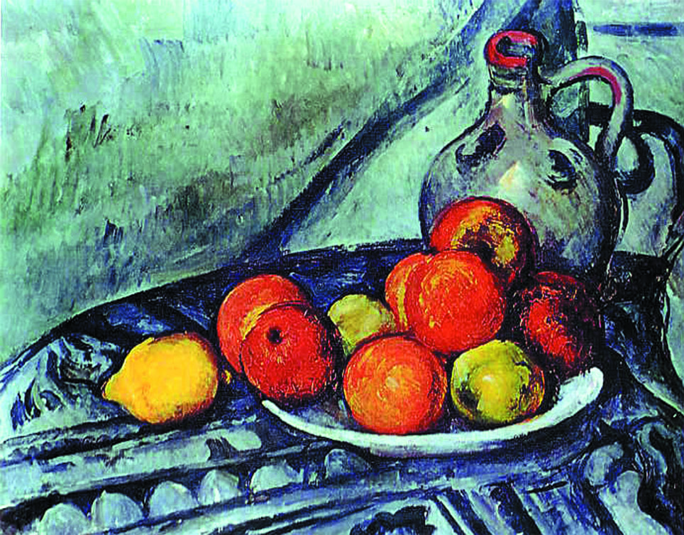
Still Life 1890–94, oil on canvas, 12.75 in. x 16 in. Museum of Fine Arts, Boston, MA, USA
In this lesson, students will:
- Analyze Cezanne’s Still Life and the composition of fruits and objects
- Identify use of line, color, shape, textures, and space in the painting
- Learn about Cezanne’s Post-Impressionist style and his desire to show form
- Sketch fruits and vegetables, using basic shapes and observing details
- Color fruits in primary and secondary colors, using a digital paint app
- Arrange still life objects in balanced compositions and use highlights and shadows to show form
Lesson Teaching Notes
A document of summary pages on the lesson’s Key Concepts, Discussion Questions, Artist Points, and Project Directions.
Print Teaching Notes Share Your Feedback


Video for Teacher or Docent (not Students)
Skip To:
Student Gallery

Materials and Setup
Photos of Setup
Class Discussion
Cezanne painted in the Post-Impressionist style, with an emphasis on color and form rather than finished detail. He used the style of heavy brushstrokes that was typical of painters of his time.
Cezanne, like other artists, loved to paint still-life compositions, such as flowers, fruits, or objects on a table. He could arrange them any way he wanted to make them seem alive. Still-life objects are easier to paint; they sit still. When Cezanne painted people, it made him angry when they moved. He would say to them, “Sit still like an apple.”
The lemon in this painting is the brightest fruit and attracts our attention first, but lemons are too sour to eat. It has fallen off the plate. Removing it would unbalance the picture. The orange at the center of the plate is bright and tempting, but if it were moved, the apple above it would roll down. This composition is carefully arranged and Cezanne can only paint it, not eat it.
Cezanne balanced the objects so each piece of fruit is important. They form a flat triangle on the round plate. Their round shapes are repeated in the round platter and jug. The bright fruits balance the large jug and make our eyes move around the painting. If the lemon or the jug were removed, the still life would no longer feel balanced.
Cezanne gave unity to the composition by repeating a round shape for the fruit in the pitcher and its lip, the designs on the table cloth, the edge of the table, and the fruit bowl. A round chair back hides behind the pitcher.
Repeated round shapes give rhythm to the composition. Our eye moves easily from the pitcher to the fruit, to the bowl and table. If a different shaped fruit, like a banana, were placed in the bowl, it would interrupt the rhythm.
Cezanne painted curving, shaded contour lines to show the rounded edges of the fruit. He painted a dark outline surrounding the pitcher, and he added shading on its surface to give it form. The edge of the table is shown with a simple, flat outline.
Thick lines on the tablecloth and background are made with strong, even brushstrokes, repeated in patches of blue, gray, and green. They make a pattern in the background.
Thin, careful brush strokes add detail and texture to the fruits and background. They add highlights and shading to show form.
Our eyes are attracted to the primary colors in the bright red apples, yellow lemon, blue pitcher, table cloth, and background. The blue background and red and yellow fruits dominate the painting. A red stripe on the blue pitcher’s lip and handle contrasts with the blue, making us notice the pitcher. Bright red and yellow fruits attract our attention.
Secondary colors are seen in the oranges, green apples, and violet shading on the pitcher. They add contrast and variety.
The warm colors of the fruit make them look delicious and tempting.
Cool colors in the background create a quiet mood, making the fruits livelier.
The fruits are painted with curving brush strokes and highlights and shadows that give them form. The pitcher looks rounded because of the highlight on its middle and the dark shadows on its right-hand side. Highlights and shadows make the fruit and pitcher appear to pop out, as though they were 3-D.
The light source is from the top left, behind the observer’s left shoulder. This light hits the objects that stick out.
Highlights shine on the green apple and the orange, the pitcher, and the rim of the bowl shine in the light, making them appear to project, or pop out from the flat canvas.
Dark shading on the lower side of the fruits, pitcher, and table cloth, show where the light doesn’t reach. These shadowy areas appear to recede, or hide, making them appear farther away.
The visual texture on the fruits looks rough, like the real texture of fruits. The rough textures of the drape and oranges contrast with the smooth surface of the green apple and the pitcher.
Download Key Concepts
Video for Teacher or Docent (not Students)
Project Directions
Still Life Fruit
Video
Skip To:
Student Gallery
Reflections
Artist Statement
Downloads and Resources
Additional Links
APP TUTORIALS:
Taking you to the Forum...