Overview
20 1/8 in. x 180 1/4 in.
Hirshhorn Museum and Sculpture Garden, Smithsonian Institution, Washington D.C., USA
Gift of Joseph H. Hirshhorn, 1972
Photo Credit: Lee Stalsworth
© 2007 Frank Stella/Artists Rights Society (ARS), New York , NY, USA
In this lesson, students will:
- Analyze Stella’s painting Darabjerd III and learn about his use of the Minimalist style;
- Identify radial symmetry, tertiary colors, and hard-edge shapes;
- Describe Stella’s use of balance and variations on a theme;
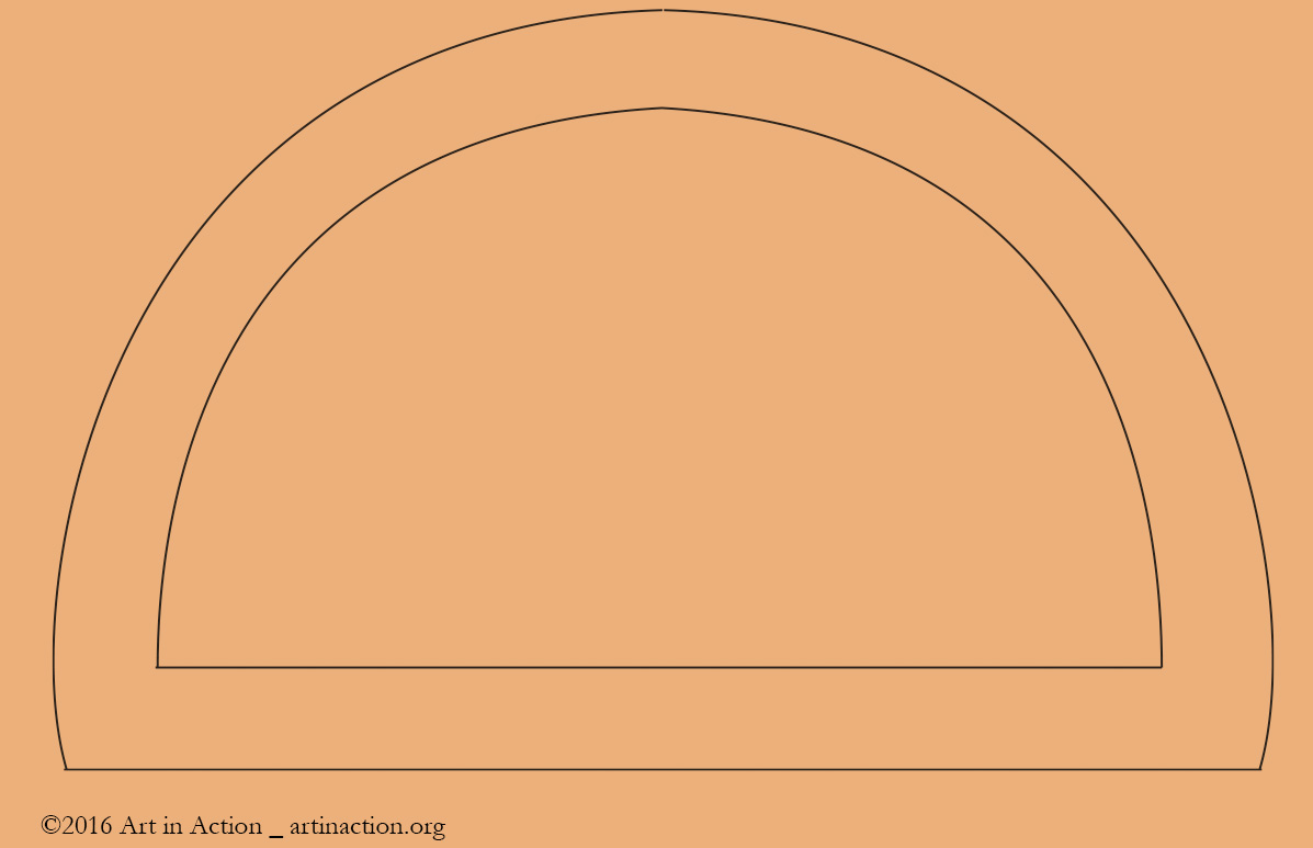
- Draw a variety of composition based on the protractor shape;
- Create color studies based on the protractor shape using tempera paint.
Lesson Teaching Notes
A document of summary pages on the lesson’s Key Concepts, Discussion Questions, Artist Points, and Project Directions.
Print Teaching Notes Share Your Feedback


Video for Teacher or Docent (not Students)
Skip To:
Student Gallery

Materials and Setup
Photos of Setup
Class Discussion
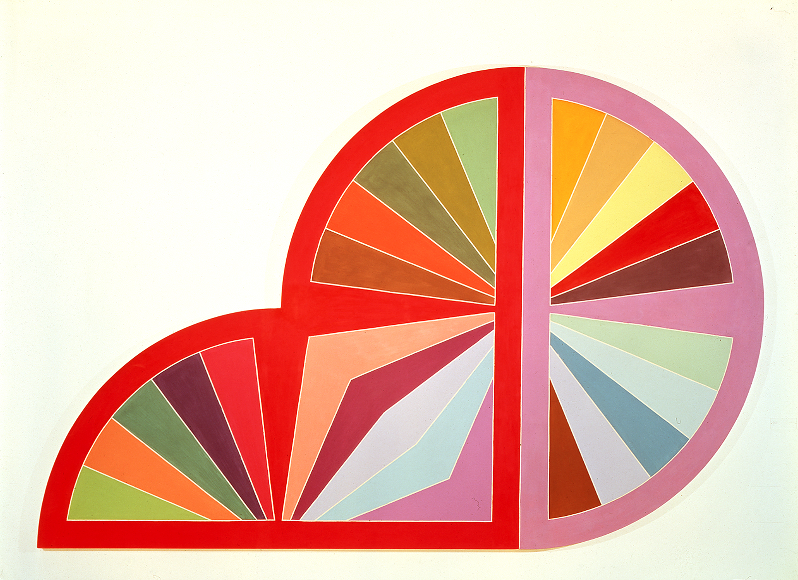
Stella’s style is called Minimalism because it minimalizes, or reduces most of the elements, such as line and shape, in order to explore the relationships of another element, color. In his early work, he used only straight black and white lines and rectangular shapes to explore simple geometric relationships. His Protractor Series uses one shape, the semi-circular protractor shape, and explores the effect of many colors. Stella’s modern work includes layers of varied shapes with brightly painted patterns.
In this painting Stella limits the formal elements of line and shape to explore the relationships of colors. Stella avoids using texture by careful painting, and he limits the importance of line by making all the white outlines the same width, and by repeating the thick protractor outlines. Space, or depth is a subtle result of the relationship of adjoining color s. Stella says of his own work, “What you see is what you see,” because he denied the use of illusions to show distance or symbolism. The protractor series of 1967 to 1971 includes very large shaped canvases combining permutations of geometric shapes filled with advancing and receding colors separated by a fine line of raw canvas.
Certain colors send messages to our brains that make us feel emotions, such as calmness, anger, happiness, or sadness. Red and pink are exciting colors, whereas blue and green are calming. All of Stella’s work is non-objective, with no recognizable subject. The subject is color, and the way it makes you feel.
Analogous, or related shades of red, pink, and violet are used in all the semi-circles. Analogous colors are next to each other on a color wheel. In this painting, reds are arranged in contrasting wedges, and analogous shades of blue are next to each other. Analogous colors give unity and connect the protractors to each other.
There are several shades of primary and secondary colors. There are also tertiary colors, mixed from primary and secondary colors. Find yellow-green, red-orange, and blue-violet.
Value is the lightness or darkness of a color. High-value colors appear lighter. The red outlines and wedges have a high value. Red mixed with white makes pink, which has a high value because it reflects more light. Orange has a higher value when mixed with white. Brown and blue are lower-value colors than red and yellow. They reflect less light. When mixed with white, brown and blue have a higher value. Placing a color next to a contrasting color increases its value, or brightness. Blue next to red makes the blue appear brighter that it does next to darker blue.
Intensity describes the brightness of a color. Pure colors are more intense than colors mixed with a darker color. Red is more intense than maroon. Yellow is more intense than gold. Bright green is more intense than brownish green. Intensity affects the feeling or mood that colors create. Pink and red colors add excitement to the shapes. Blue shades are calming. The combinations of colors create different moods.
Play song Roy G. Biv.
Wedges radiate from a central point on the border to even slots along the edge, demonstrating radial symmetry, or balance in the circular shape.
With such a simple shape, wanting to avoid boring repetition, Stella combined the shapes in asymmetrical configurations, varying the colors to show movement.
The repetition of the color red and analogous pink in the borders and wedges creates harmony that unites the composition. In the pink-bordered semi-circle the border becomes the central wedge, and it is repeated in the bottom wedge of the central shape. Darker values of red are repeated in each semi-circle.
By limiting his design to a simple, repeated shape, Stella was able to concentrate on color. The repeated colors and shapes unify this composition.
The circular shape is ready to roll, but the seated semicircle stops it from moving forward. The wedges, like spokes in a wheel, seem to move on their own. Would they move in a straight line? Would they move from front to back in space? In the format of the picture, the space is 2-D. Movement from side to side is implied by the extension of the radial lines.
In the Protractor series, Stella arranged flat colors in variations of the semi-circular shape of a protractor. By limiting shapes he was able to emphasize the colors. There are 3 semicircular protractor shapes, each with radiating wedges inside them and chevron-like arcs where two shapes overlap.
The simple geometric shapes of circle, semi-circle, and wedge are repeated to create a predictable composition.
Wedges of the single semicircle and the center semi circle overlap, forming an implied edge that becomes the wedge of the other circle.
The wedges have hard edges, with precise, even borders. They look like they were painted by a machine. Stella tried to avoid showing the gesture of his paintbrush. A thin white line outlines all but 3 wedges.
Each wedge converges on a point at the center of the straight edge of the semi circle. The two halves of the circle share a center point.
These semicircles are painted on a shaped canvas with a horizontal, rounded format.
The center point of each semi circle is hidden under the straight edge of the border, which overlaps the tips of the wedges.
Download Key Concepts
Video for Teacher or Docent (not Students)
Project Directions
Color Fans
Video
Skip To:
Student Gallery
Reflections
Artist Statement
Downloads and Resources
Additional Links
App Tutorials:
- Sketchbook Edu PowerPoint
- Adobe Draw PowerPoint
- Brushes Redux PowerPoint
- Paper 53 PowerPoint
- Sketch Pad PowerPoint
Taking you to the Forum...